- Data Visualization
Petr V. Nazarov, LIH
2018-03-05
2.1. Visualize categorical data
Let’s work again with counts_anno file.
Now we load the data and consider only 2 columns (biotype and chromosome) as factors. Let’s also use the first column as row names.
Anno = read.table("http://edu.sablab.net/rt2018/data/counts_anno.txt", header=T, sep="\t", as.is=TRUE, row.names = 1)
Anno$gene_biotype = factor(Anno$gene_biotype)
Anno$seqname = factor(Anno$seqname)
str(Anno)
## 'data.frame': 55804 obs. of 8 variables:
## $ gene_name : chr "TSPAN6" "TNMD" "DPM1" "SCYL3" ...
## $ gene_biotype: Factor w/ 28 levels "3prime_overlapping_ncrna",..: 16 16 16 16 16 16 16 16 16 16 ...
## $ seqname : Factor w/ 24 levels "1","10","11",..: 23 23 13 1 1 1 1 19 19 19 ...
## $ start : int 99884983 99839799 49551773 169822913 169631245 27939633 196621008 143816984 53363765 41040684 ...
## $ stop : int 99894942 99854882 49574900 169863148 169823221 27961576 196716634 143832548 53481684 41067715 ...
## $ strand : chr "-" "+" "-" "-" ...
## $ length : int 2968 1610 1207 3844 6354 3524 8144 2453 8463 3811 ...
## $ gc : num 0.441 0.425 0.398 0.445 0.423 ...Let us plot some factorial data. For example, we can check how many genes are annotated in each chromosome.
plot()- generic command to plot something
plot(Anno$seqname)Hmm… not too nice! We lose some chromosome names and they are sorted wrongly! Let’s improve
col- color of the plotlas- axis text direction (2 for perpendicular)cex.names,cex.axis- size of the names on the catecorical axis and numerical axismain- title of the figure. Alterntivelytitle()can be called to add names after.xlab,ylab- names of axes
Anno$seqname = factor(Anno$seqname,levels=c(1:22,"X","Y"))
plot(Anno$seqname, las=2, col="skyblue", cex.names =0.7,cex.axis =0.7, main="Number of annotate genes", xlab="Chromosomes", ylab="Genes")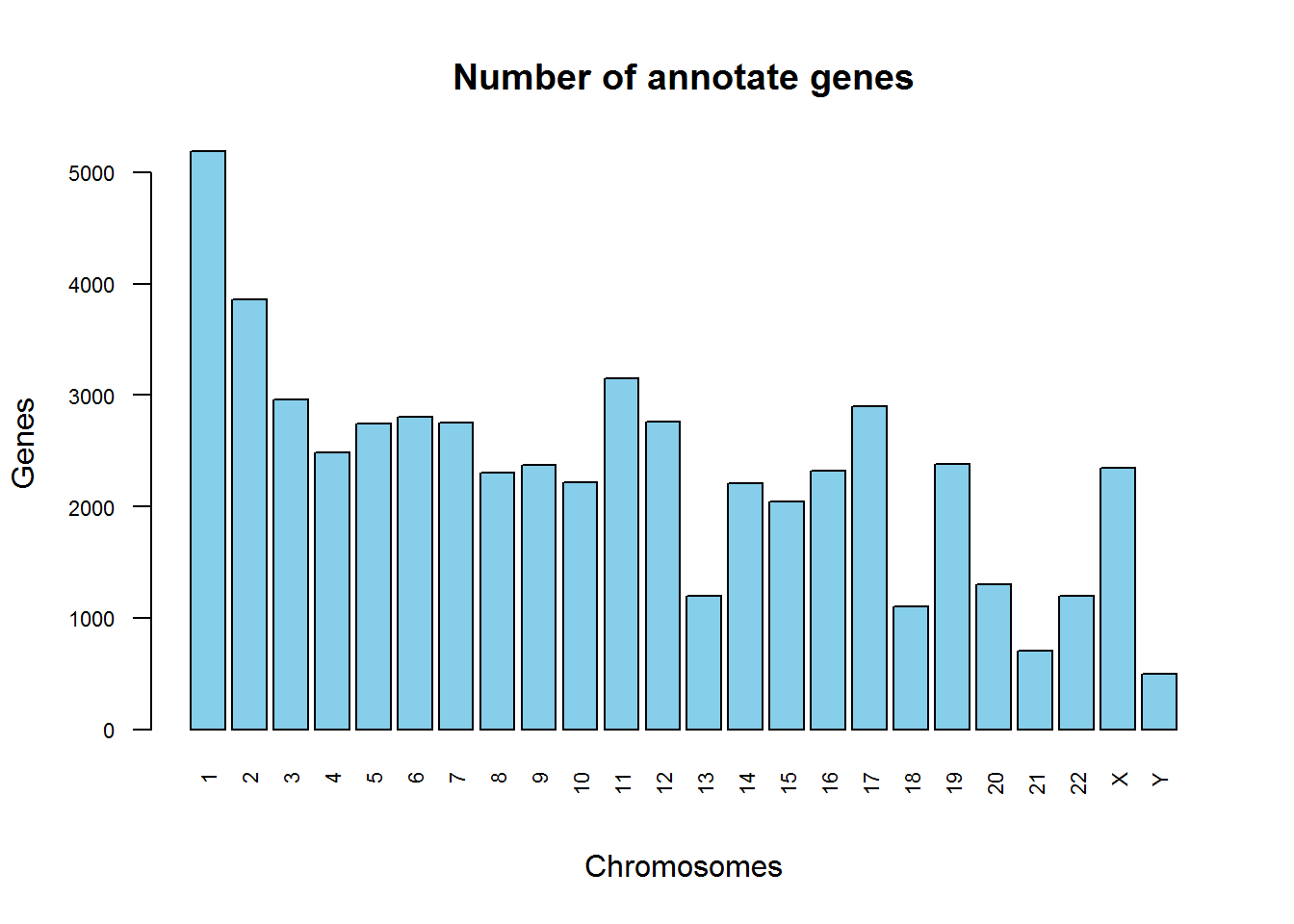
Pie-chart can be used as well (though not recommended). Here are biotypes in this “ugly” representation :)
pie(sort(summary(Anno$gene_biotype)), col=1:nlevels(Anno$gene_biotype), cex = 0.8)
title("Biotype of Annotated Genes",sub=sprintf("There are %d genes in total",nrow(Anno)))
2.2. Simple scatter plots
Let’s see whether there is some dependency between gene length and GC-content. In order to improve representation - consider log2-length
plot(log2(Anno$length),Anno$gc,xlab="log2 length", ylab="GC-content")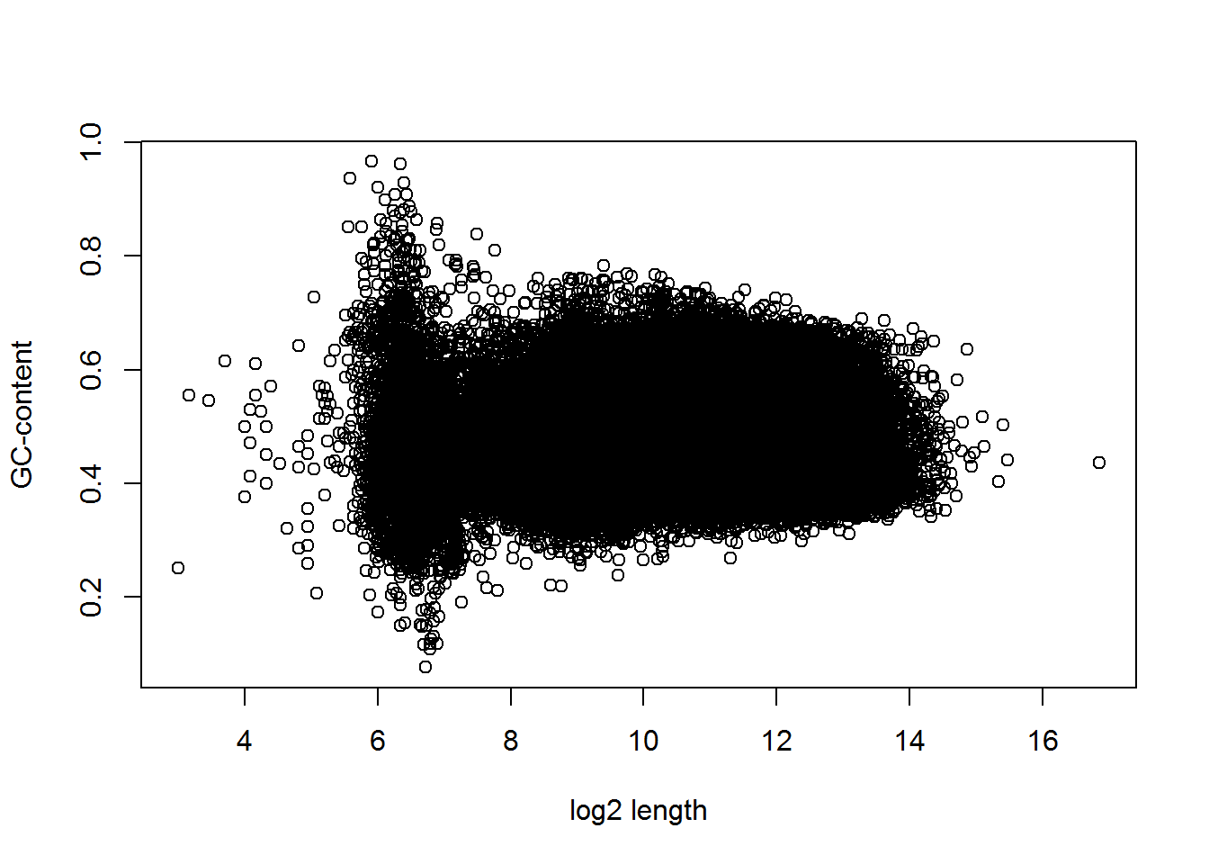
It seems, there is a structure… Let’s improve visualization, showing coding genes in green, and lincRNA in red. We can use RGB coding of the colour adding transparency (format: #RRGGBBAA, RR - red in hex, etc)
legend()- adds legend to the existed plotabline()- adds a line to plot (horizontal, vertical ot tilted)pch- code of the point. See help?parfor all basic graphical parameterslwd- width of the linelty- line type (solid, dotted, etc)
## define colours
color = rep("#00000011",nrow(Anno))
color[Anno$gene_biotype == "protein_coding"] = "#0000FF33"
color[Anno$gene_biotype == "lincRNA"] = "#00FF0033"
color[Anno$gene_biotype == "miRNA"] = "#FF000033"

## plot
plot(log2(Anno$length),Anno$gc,xlab="log2 length", ylab="GC-content", pch=19, col=color)

## add legend
legend("topright",legend =c("other","coding","lincRNA","miRNA"),col=sort(unique(color)),pch=19 )

## add horisontal and vertical lines corresponding to mean values
abline(h=mean(Anno$gc[Anno$gene_biotype == "protein_coding"]),col="#0000FF",lwd=2,lty=2)
abline(h=mean(Anno$gc[Anno$gene_biotype == "lincRNA"]),col="#00FF00",lwd=2,lty=2)
abline(h=mean(Anno$gc[Anno$gene_biotype == "miRNA"]),col="#FF0000",lwd=2,lty=2)

abline(v=mean(log2(Anno$length[Anno$gene_biotype == "protein_coding"])),col="#0000FF",lwd=1)
abline(v=mean(log2(Anno$length[Anno$gene_biotype == "lincRNA"])),col="#00FF00",lwd=1)
abline(v=mean(log2(Anno$length[Anno$gene_biotype == "miRNA"])),col="#FF0000",lwd=1)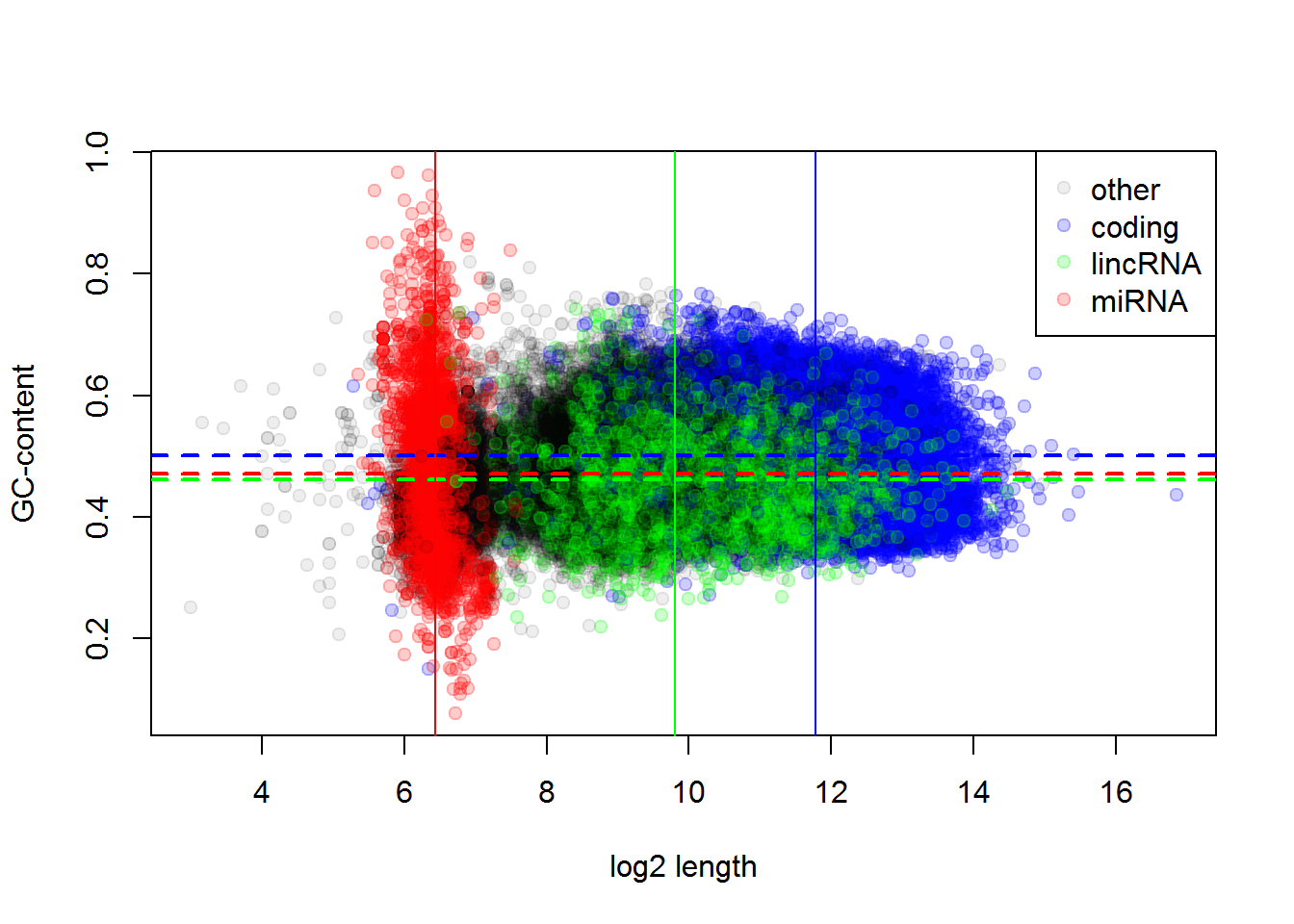
2.3. Distributions and box-plot
Distributions can be shown using hist() or plot(density()) functions.
hist(log2(Anno$length),probability = T, main="Histogram and p.d.f. approximation", xlab="log2 length",col="gray")
lines(density(log2(Anno$length)),lwd=2,col="blue")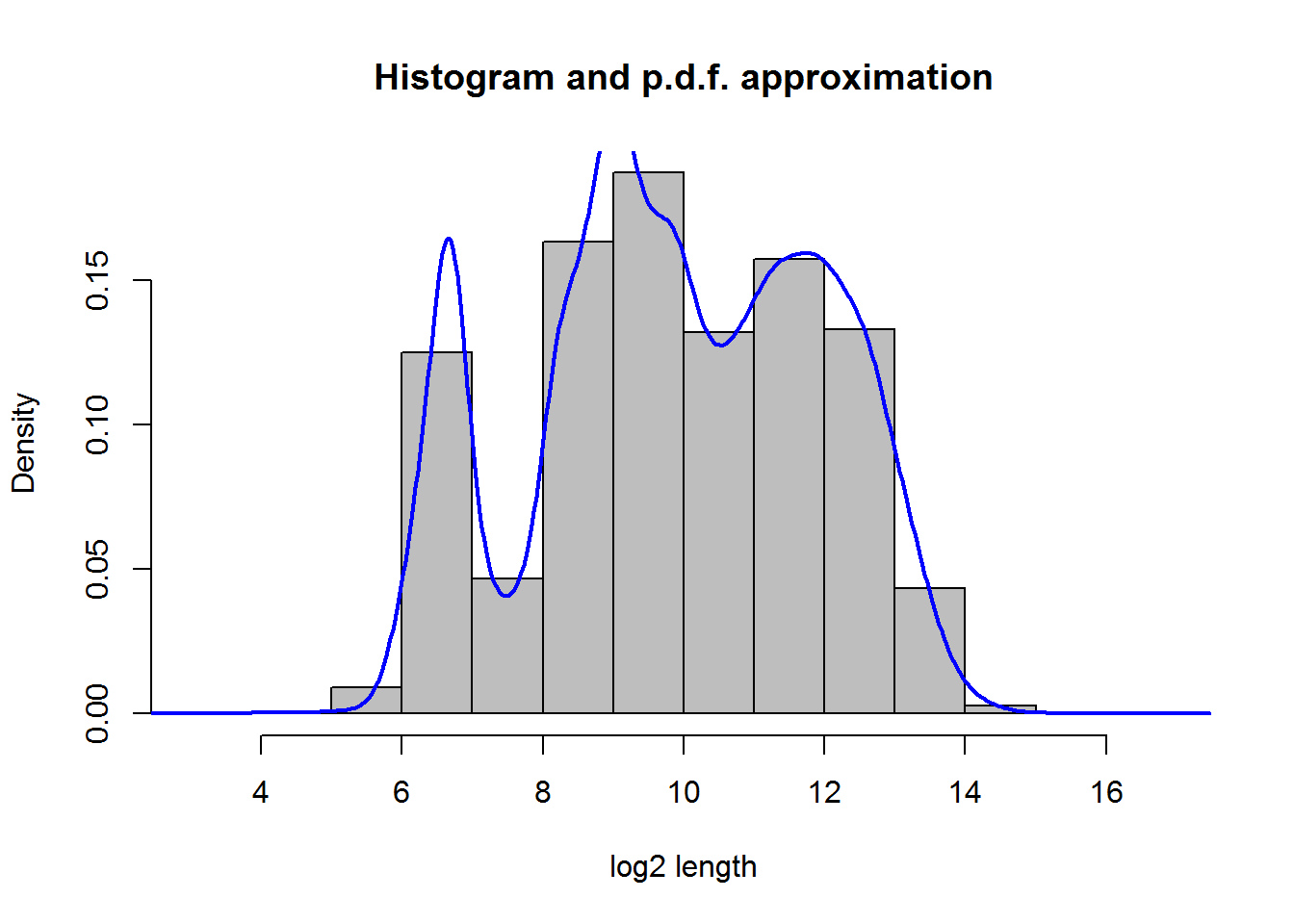
Now let us build a standard boxplot that shows GC-content variation for chromosomes. We will use formula here: ‘variable’ ~ ‘factor’. It is the easiest way.
boxplot(gc ~ seqname, data=Anno, col="gold",las=2)
title("GC variability",  ylab="GC-content",xlab="Chromosome")
## add average GC level
abline(h=mean(Anno$gc),col="blue",lty=2)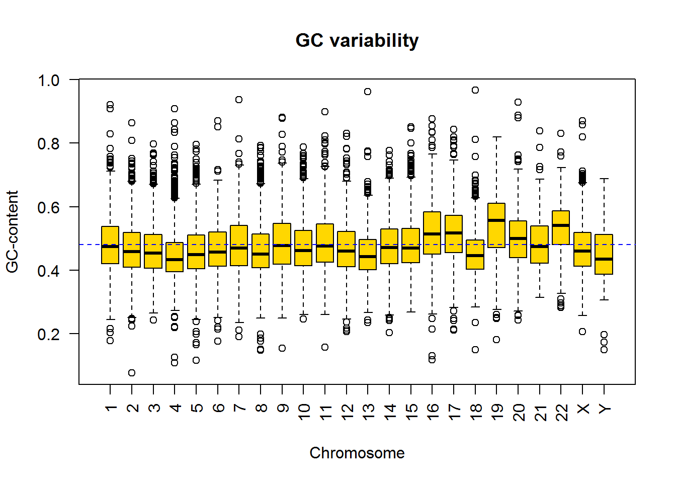
2.4. Heatmaps
Heatmaps are a useful 2D representation of the data that have 3 dimensions. Example: expression (dim 1) is measured over n genes (dim 2) in m samples (dim 3). Heatmaps will automatically cluster the data (see Lecture 9). Let us make a heatmap for internal Iris dataset. We should also transform data.frame to a matrix
Let us first load a gene expression dataset and select some important genes for visualization.
## load oncogenes
oncogenes = scan("http://edu.sablab.net/rt2018/data/oncogenes.txt",what = "")
str(oncogenes)
## chr [1:17] "SOX2" "PDGFRA" "FGFR1" "WHSC1L1" "CDKN2A" "TP53" "NFE2L2" ...## load RNA-seq data for lung squamous cell carcinoma patients
Data = read.table("http://edu.sablab.net/rt2018/data/counts.txt",header=TRUE,sep="\t",row.names = 1)
str(Data)## 'data.frame': 60411 obs. of 18 variables:
## $ SN327: int 11404 95 5058 4015 4137 266 77088 98 29717 1285 ...
## $ SN328: int 4652 112 4899 7001 6626 1161 41068 118 13984 1908 ...
## $ SN349: int 12880 107 5948 6573 4753 523 67236 169 25633 1952 ...
## $ SN354: int 5252 149 6508 5730 4728 813 56781 250 10469 1830 ...
## $ SN405: int 7752 169 4596 5858 2926 221 62818 159 13303 1326 ...
## $ SN449: int 12215 161 4009 4811 3754 620 70614 67 16995 1281 ...
## $ SN450: int 10898 86 5288 5010 3051 1012 107658 142 20073 1592 ...
## $ SN667: int 9793 370 4371 4905 3563 118 78049 98 27813 2248 ...
## $ SN679: int 7039 340 3560 4215 2478 949 62394 120 6482 1036 ...
## $ ST327: int 1768 32 3346 6450 8849 46 27302 125 165479 1653 ...
## $ ST328: int 3944 7 5062 6055 5424 1483 24056 185 47563 2947 ...
## $ ST349: int 4703 54 5837 7117 7773 644 22856 178 94699 2573 ...
## $ ST354: int 6323 247 8614 5027 8724 83 8912 79 8426 3487 ...
## $ ST405: int 1496 16 2546 4677 6252 120 27303 143 70070 1364 ...
## $ ST449: int 5547 33 4912 6942 9630 693 15821 217 87792 2248 ...
## $ ST450: int 6467 131 5055 4591 7006 1053 33937 101 104311 2242 ...
## $ ST667: int 2136 43 4608 3955 4599 180 14647 154 41703 1185 ...
## $ ST679: int 2778 123 1938 1945 2587 909 13117 179 6037 1818 ...## we need to get oncogenes... but annotation is not the same!
## so we should rename based on Anno table
ensg = rownames(Anno)[Anno$gene_name %in% oncogenes]
## extract data and put it into matrix
X = as.matrix(Data[ensg,])
str(X)## int [1:15, 1:18] 4654 23527 149 60890 44450 72 3325 968 25234 0 ...
## - attr(*, "dimnames")=List of 2
## ..$ : chr [1:15] "ENSG00000077782" "ENSG00000079102" "ENSG00000079999" "ENSG00000109670" ...
## ..$ : chr [1:18] "SN327" "SN328" "SN349" "SN354" ...knitr::kable(Anno[ensg,c("gene_name","gene_biotype","length","gc")])| gene_name | gene_biotype | length | gc | |
|---|---|---|---|---|
| ENSG00000077782 | FGFR1 | protein_coding | 12698 | 0.5543393 |
| ENSG00000079102 | RUNX1T1 | protein_coding | 13527 | 0.4224884 |
| ENSG00000079999 | KEAP1 | protein_coding | 3761 | 0.6269609 |
| ENSG00000109670 | FBXW7 | protein_coding | 4842 | 0.4078893 |
| ENSG00000116044 | NFE2L2 | protein_coding | 5907 | 0.4472660 |
| ENSG00000118046 | STK11 | protein_coding | 8504 | 0.6633349 |
| ENSG00000134853 | PDGFRA | protein_coding | 9732 | 0.4298192 |
| ENSG00000141510 | TP53 | protein_coding | 3924 | 0.5259939 |
| ENSG00000147548 | WHSC1L1 | protein_coding | 9923 | 0.4241661 |
| ENSG00000147889 | CDKN2A | protein_coding | 4400 | 0.5736364 |
| ENSG00000162733 | DDR2 | protein_coding | 3777 | 0.4919248 |
| ENSG00000178568 | ERBB4 | protein_coding | 13007 | 0.3954025 |
| ENSG00000179603 | GRM8 | protein_coding | 6183 | 0.4636908 |
| ENSG00000181143 | MUC16 | protein_coding | 43524 | 0.5027801 |
| ENSG00000181449 | SOX2 | protein_coding | 2508 | 0.5071770 |
heatmap(X, main ="Oncogenes")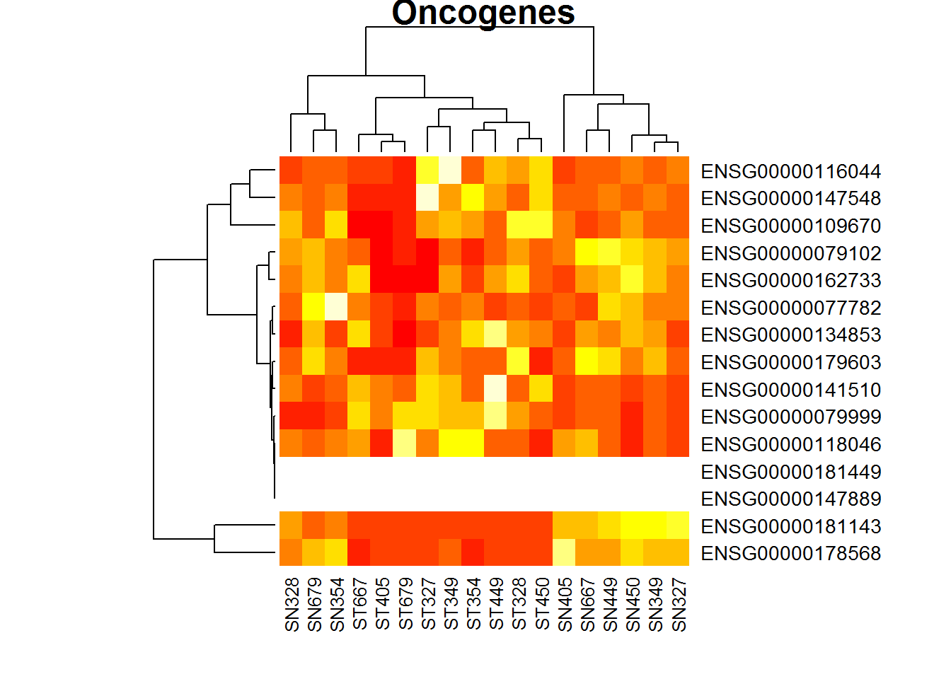
Not very beautiful clustering. What can we tell about the data in X?
plot(density(X))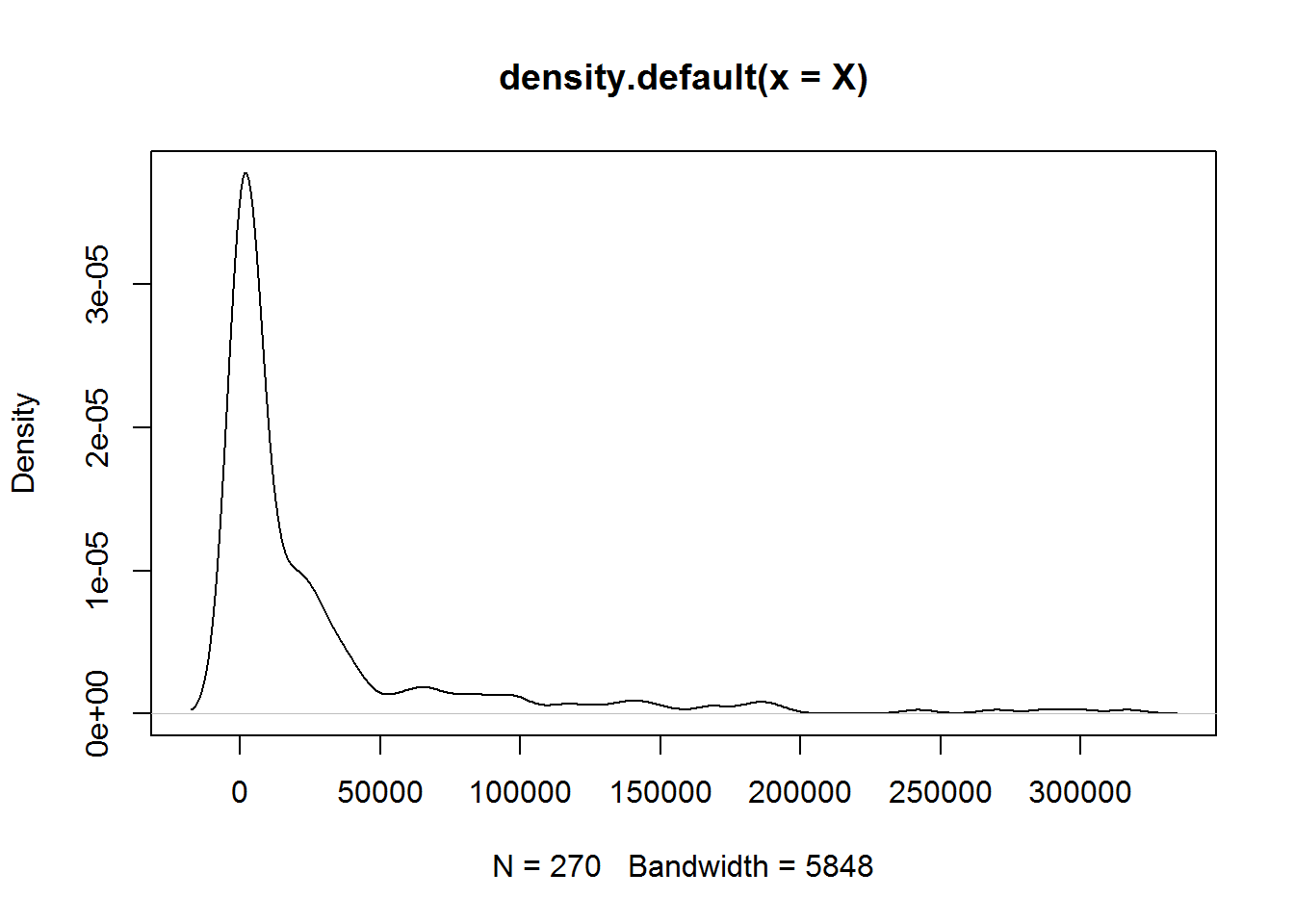
The distribution is strongly right-skewed! It is hard to work with such data! Let’s log-transform the data and build another heatmap.
heatmap(log2(1+X), main ="Oncogenes")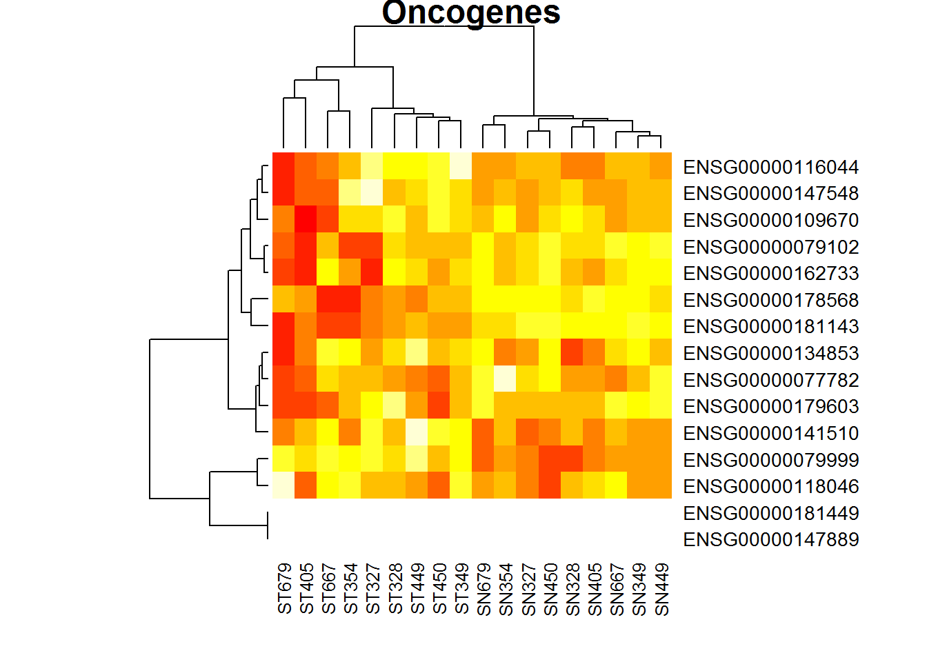
Now ST (tumour samples) and SN (normal samples) are clustered together. To finalize - let’s visualize in a more beautiful way, colouring the groups and setting comprehensible gene names.
XAnno = Anno[ensg,]
rownames(X) = XAnno$gene_name

# more advanced heatmap
color = c(SN="green",ST="orange")[sub("[0-9]+","",colnames(X))]
heatmap(log2(1+X),ColSideColors = color,col = colorRampPalette (c("blue","wheat","red"))(1000))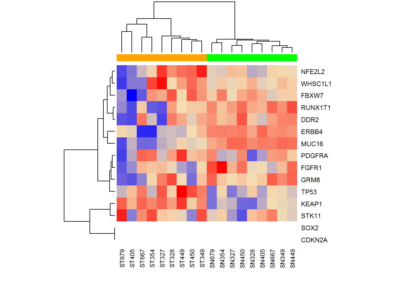
For more advanced heatmaps - you could check pheatmap package.
2.5. Output “devices”
To open new window use x11().
- You can draw your image directly into the figure file using special devices:
pdf(),png(),tiff(),jpeg(). Always finalize drawing to file by callingdev.off()function (no parameters needed).
Please run line-by-line:
x11()  # try x11(width=8, height=5)
plot(X["TP53",], pch=19, col = color, cex=2,xlab="samples",ylab="counts",main="TP53 expression")
legend("topleft",legend=c("normal","tumour"),col=c("green","orange"),pch=19,pt.cex=2)
text(1:ncol(X),X["TP53",],colnames(X),cex=0.7)

## now save into PDF
pdf("TP53.pdf")
plot(X["TP53",], pch=19, col = color, cex=2,xlab="samples",ylab="counts",main="TP53 expression")
legend("topleft",legend=c("normal","tumour"),col=c("green","orange"),pch=19,pt.cex=2)
text(1:ncol(X),X["TP53",],colnames(X),cex=0.7)
dev.off()
getwd()
Exercises
- Visualize distribution of gene lengths (log2) for protein coding genes and lincRNAs in one plot. Hint: use
linesinstead ofplotto add more data to the same plot.
plot,density,lines
- Draw boxplots, showing variability of the gene length over various biotypes.
boxplot
- Make a scatter plot showing relation b/w 2 genes ENSG00000079102 (RUNX1T1) and ENSG00000162733 (DDR2). Hint: these genes are among oncogenes and should be in your
Xmatrix.>
plot
![]()